


Pure Studio
Pure Studio is a premium indoor cycling studio located in the heart of Downtown San Diego with classes that offer an incredible sensory experience. The rides are led by uplifting & charismatic instructors that motivate riders to reach their full potential.
My Role
Mobile App Design, Visual Design, Wireframing, Mood-boarding
Client
Pure Studio
Year
2018
The problem
The prior version of the Pure Studio website featured a complicated booking system with an outdated interface, causing navigation difficulties and numerous accessibility issues. Conversations with riders highlighted the absence of a user-friendly way to view upcoming rides and the use of stock images that created a disconnected corporate vibe. It was evident that the website didn't support the preferred method of booking for most riders—mobile apps. Additionally, there was a lack of class information for new riders, further contributing to user friction.

Design Goals
Educate & Inform
Design an intuitive, modern, and responsive website that educates new riders about the bikes, equipment, and class types.
User first design
Create a user-centered mobile app cohesive to the website where riders could effortlessly view upcoming classes, learn more about each instructor, and book rides in advance.
Showcase real people
Attract new customers by utilizing real lifestyle imagery of the studio’s instructors.

Inclusive booking
Within the studio, there were thirty five available for each class, positioned at varying distances from the front to the back. In conversations with actual riders, we discovered that certain individuals might feel reserved when joining group fitness sessions. If unable to secure a preferred spot, they often chose not to participate in the class which led to classes not filling up. It became evident that we needed a way to visually represent the space and enable riders to reserve a spot that suited their comfort level. Extensive research was carried out in different sectors to find effective methods of visually representing the studio that would resonate with the riders.


Early wireframes

Effortless booking from the homepage
We chose a top-down view displaying all studio bikes, allowing riders to see available and reserved spots, understand the class layout, and preview details like TVs, fans, and the instructor's position.

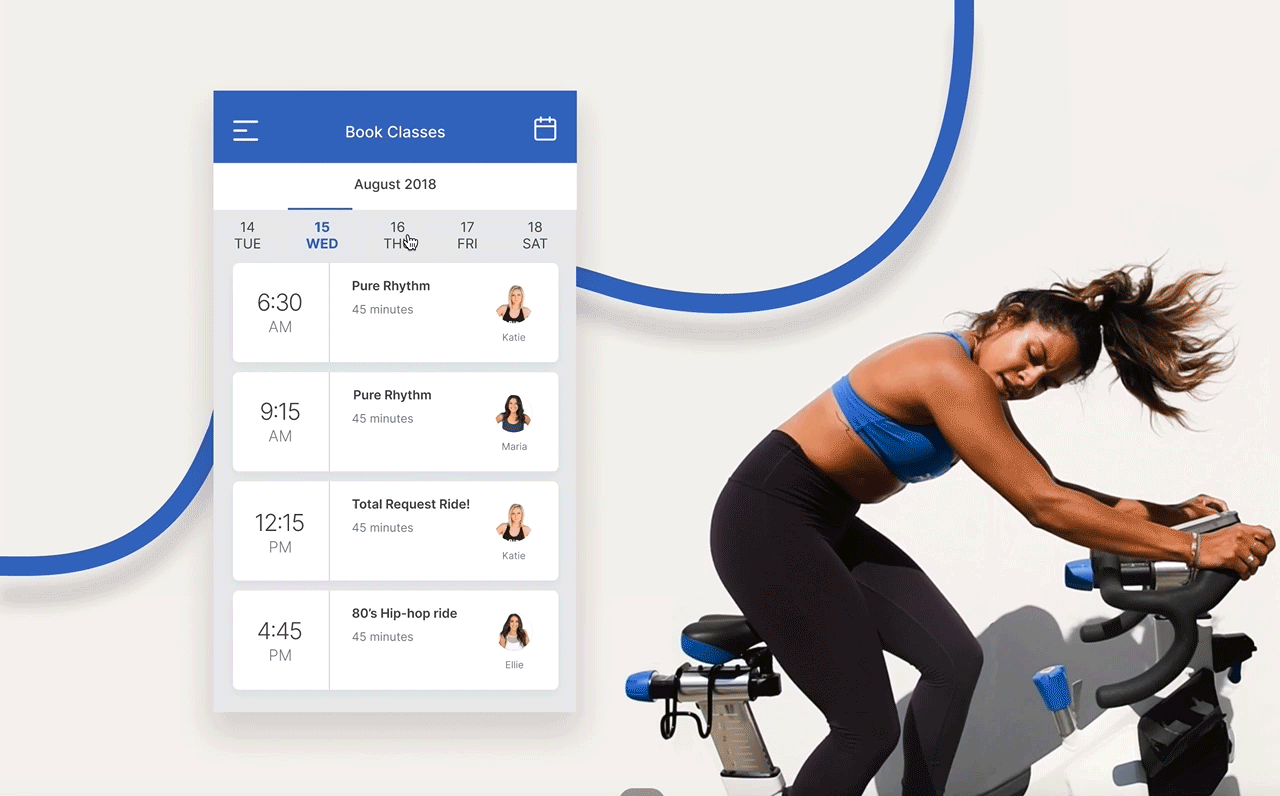
Mobile app class booking
For consistency in the mobile app's booking experience, we replicated the interface and functionality found on the desktop site.

Full homepage design

Results

Improved Retention and Loyalty
There was a noticeable 20% increase in customer retention, indicating higher loyalty levels and repeated engagements with the studio's services and offerings.

Enhanced Conversion Rates
Post the redesign of the website and the introduction of the mobile app, there was a remarkable 35% uptick in conversion rates, translating to more memberships sold and class bookings made.